
Iconic Literature 2 | Ligeia & Titania
A Tale of Two Paintings
These two wooden Box Toppers are a part of Iconic Literature 2, a classic literature themed sketch card set, released by Iconic Creations this summer. They were the only box toppers I created for this set. Due to time constraints and prior obligations, I was unable to contribute any sketch cards.
Box toppers measure 5x7 (12.7x17.78cm), with a 4x6 (10.16x15.24cm) art space, and arrived with a coating of paint putty to prime the art surface, as well as a laser etched border.
In this blog post I talk about my experimentation with painting watercolors on wood using Daniel Smith's Watercolor Ground. I also cover the creative process of conceptualizing these two classic literature based fantasy illustrations, and my general experience with this ‘new to me’ technique. My subjects were Edgar Allan Poe's Ligeia, and Titania, the faerie queen from William Shakespeare's A Midsummer Night's Dream.
Painting Watercolors on Wood | what is this Sorcery???
It’s not remotely impossible, nor is it even a ‘new’ thing. But it was certainly a new challenge to me. I took on this relatively small bit of contract work for the following two reasons:
First, it was a chance for me to try something I have wanted to attempt for quite some time. Having a monetary incentive was certainly a bonus!
Second, I am attempting to take on a small amount of contract work for 2021. After suffering through severe creative burnout in 2017, I am trying to acclimate myself to hard deadlines again. However, I do not intend to return to full time contract or commission work for the foreseeable future.
Now, as for how I went about painting a medium that requires a porous surface onto a relatively non-porous surface, it’s actually easier than you might think. You can prime almost any surface (yes, including wood, glass, and metal), with a layer of watercolor ground. This ground, which can also be layered over gesso, helps provide something to absorb those watercolor pigments. However, it will never be nearly as absorbent as paper. I ended up using Daniel Smith’s Watercolor Ground, which came highly recommended from fellow watercolor artists.
I learned a long time ago to use as little water as possible because most sketch card stock isn’t terribly absorbent either. Layering takes patience, caution, and an understanding that you are constantly walking a delicate line between applying just enough pigment, and applying too much water which will wash away all your hard work. Basically, I was already used to a technique that functions well with using a watercolor ground so I knew this wouldn’t be a huge leap. But I was still highly unsure of the results I would get!
Iconic Creations kindly gave me an extra box topper from an older set to use as a sample so I could familiarize myself with the process before jumping in head first. Never under estimate the importance of experimentation! It could save you a lot of tears and frustration in the future.
Test Boxt Topper - I used the leftover transfer for my (currently unfinished) Thistle Fairy & Honey Bees illustration to give me some quick but refined lines to ink and experiment with. The Box Toppers themselves arrived with the art surface already primed with paint putty, which did offer a slightly absorbent surface. Inks went down smooth without any bleeding. I used my favorite Zig Mangaka pens, but I had to constantly clean the pen nibs by drawing lines on a clean piece of paper to prevent the putty residue from gumming them up. After the inking was complete, I gave the surface a couple coats of Daniel Smith’s transparent Watercolor Ground and let the box topper cure 24 hours. It turns out I went too heavy with the ground, perhaps too soon after inking, and some of my lines bled.
Good details, but minor bleeding due to my error with the watercolor ground.
Gold leaf test! No issues using miniatum ink and 14kt double gold leaf.
Onto the watercolors! Tough to build layers, but overall, not too shabby.

Good Enough!
No Need to Finish. Time was of the essence, and all I needed to do was make sure I could paint without ruining anything. The test itself didn’t turn out too bad, but I overworked a few things and quickly discovered my limitations with the watercolors themselves. And that of course was the entire point.
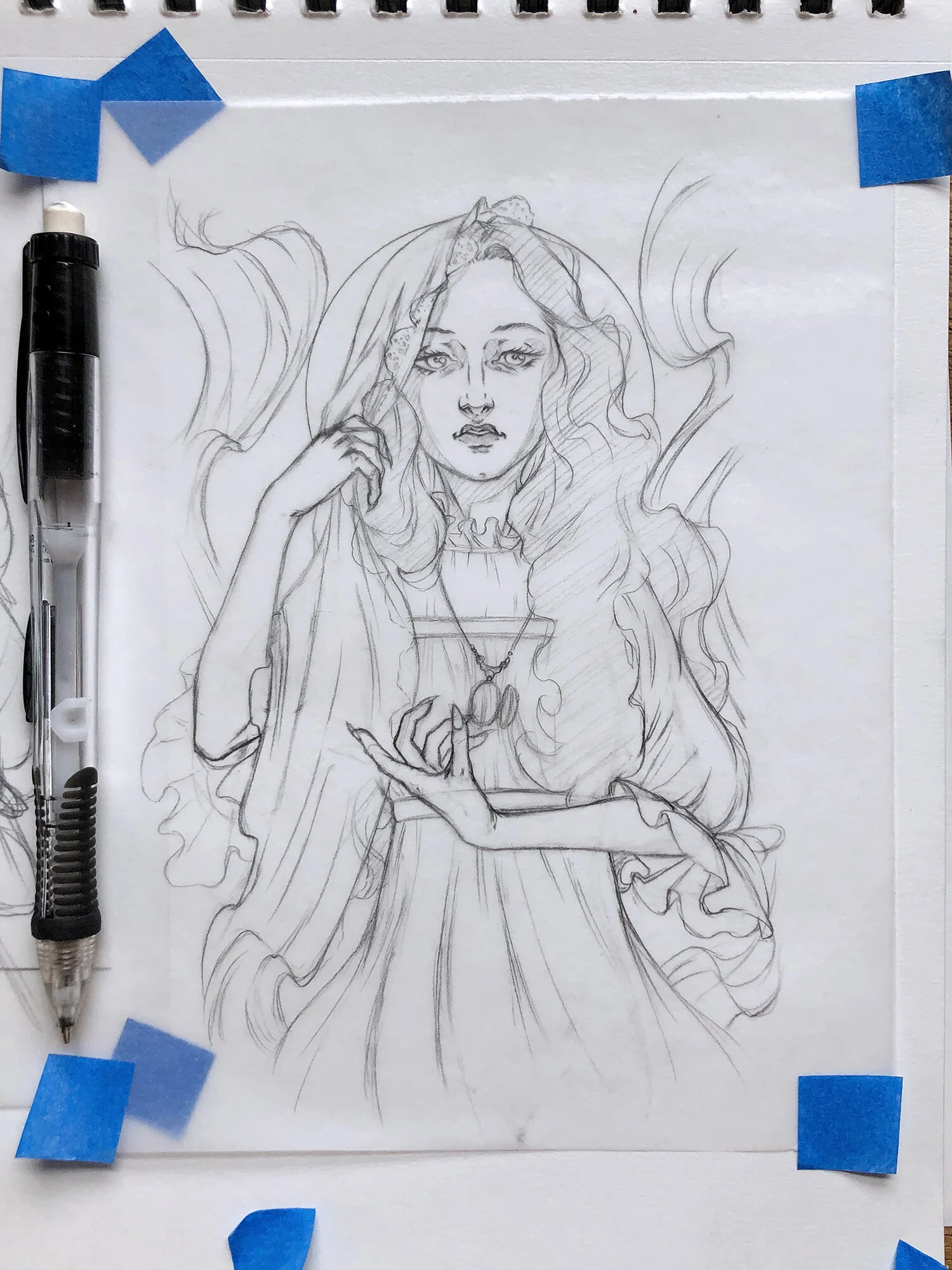

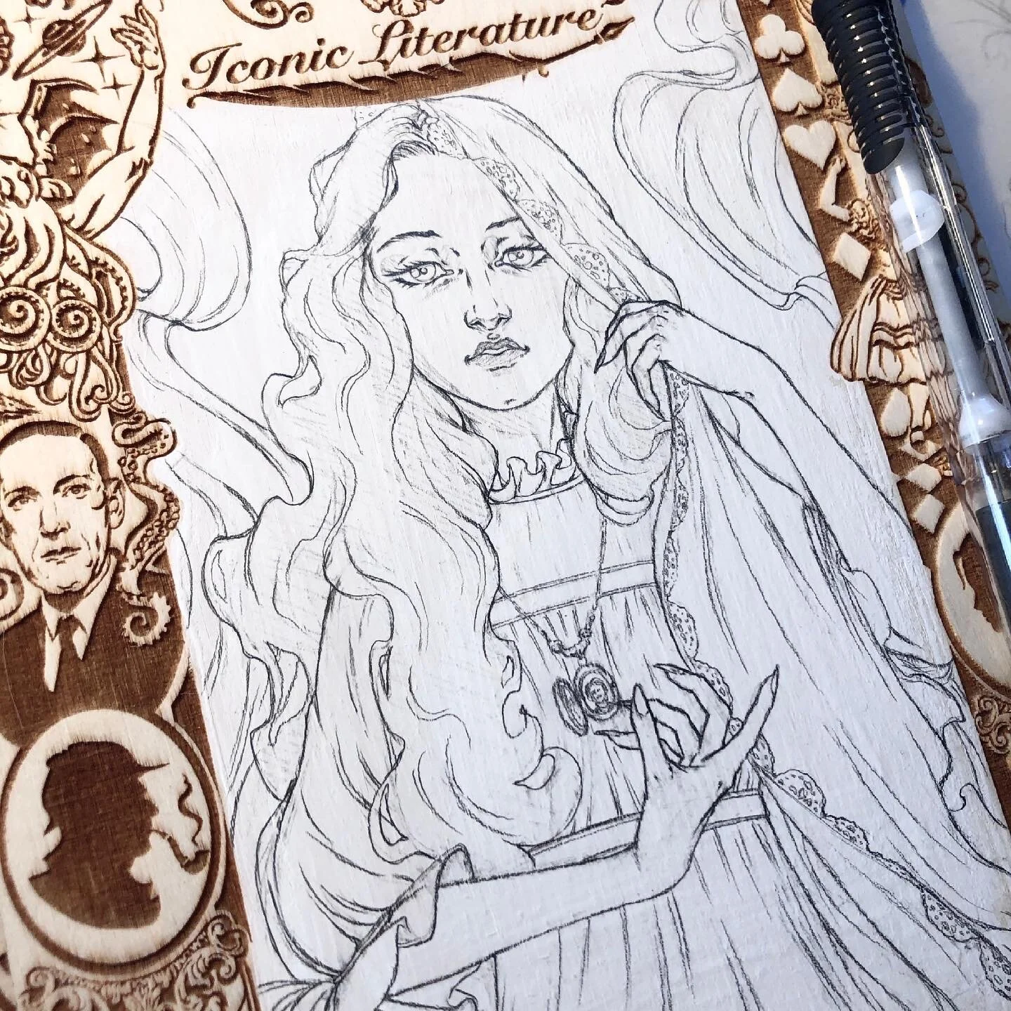
It all starts with a good concepts - These are my transfers. I drew them on tracing paper over semi-refined sketches. If you noticed the images are mirrored from the final paintings, that is because I flip the tracing paper so the graphite side faces my drawing surface and then use my thumbnail to apply pressure and “scratch” over the line art to transfer it.
I have always loved experimenting with duality in art.
Opposites can be quite complimentary. If nothing else, putting two contrasting images side by side will amplify their differences. Plus, variety is a wonderful thing! Perhaps it’s all those years I spent limited by my own fear of drawing new things, but I cannot stand repetition in my own art.
I knew I wanted to draw Edgar Allan Poe’s hauntingly beautiful (and undead) Ligeia from the start. I was unsure of the second concept, but my friend Achilleas from Iconic Creations had fallen in love with the in-progress shots of my Thistle Fairy and Honey Bees drawing, as well as the ensuing Box Topper Test, and he asked if I could draw something similar. Titania from A Midsummer Night’s Dream was a perfect fit! Knowing that I had two completely different characters from stories with two completely different narratives, I wanted to play that up as much as possible; one dark and mysterious, and the other bright and whimsical!


Transferred Pencils with line refinement - While I left the surface of Ligeia’s Box Topper as is, Titania’s Box Topper had a few uneven spots from the paint putty that needed to be sanded down. I also added a layer of Golden acrylic white gesso to make sure the wood was covered. The gesso turned out to be much harder to draw on because my pencil transfer did not erase as easily once I started refining those lines. I also discovered that my Zig Mangaka pens will erase on the gesso, even where the pencil transfer doesn’t!
I started Ligeia first, and if you’ve read one of my previous blog entries, Artistic Alchemy, then you’ve seen some of these images before and have an understanding of what I was going through at the time. The day I finished my Ligeia concept and transferred her to the first box topper I also received news of my mother’s dementia diagnosis.
Inspiration is a funny thing.
I struggled for days to land the right concept for Ligeia. But Titania came easily. I got her on the first try, which is incredibly rare for me. That’s always how art has worked for me; sometimes flowing effortlessly, and sometimes like pulling teeth.

Concept Idea Sheet - Write fast, scribble faster! At this time I hadn’t decided on the subject for my second box topper. Ligeia got a quick concept scribble and an entire page of barely legible notes that I took directly from Edgar Allan Poe’s description of her in his prose.

After finally landing my Ligeia concept, I was stuck on what to do for the second Box Topper. I debated a White Rabbit, but felt I was going in a direction that was too close to older works. Also, sometimes I write angry notes to myself in my sketchbook.
Titania’s concept took only a day to square away. Somehow I landed on the pose and expression I wanted right from the start. A rare and wondrous event, that is!
Pencils, Ink, Watercolor Ground, More pencils, then finally…
It’s time to Paint!
Inking went relatively well on both box toppers. No bleed, and very few ‘oops’ moments. Once the inks were complete, I coated both Box Toppers with the Daniel Smith’s Watercolor Ground and let them cure for a weekend.
I ended up adding quite a bit of pencil shading to Ligeia in order to give myself more of a solid base for dark areas, like her hair, and to provide shadow guides that would give her a little more drama. You can’t do much for building layers with a watercolor ground, the dry paint will activate and wash away easily. This makes achieving dark colors, and especially smooth looking dark colors, very difficult. Small areas aren’t so bad because you can get away with using a just damp brush with more pigment than water. Large areas were much trickier. Most of the colors were painted in just one layer.
The Prep Work Always Takes Longer Than The Actual Painting
What is true for painting the interiors of houses is also true for my watercolors. All art is hard, but the most difficult part for me is deciding what I am going to do. Choosing the concept I want to draw and picking out my color palette are probably my two biggest speed bumps. Refining the concept, inking the lines, priming the surface if needed (like the watercolor ground), and then fine tuning everything with graphite or additional ink is what I consider ‘meditative work’. Not much brain power is required and each step in of itself isn’t too bad, but all together they seem like a lot of time when compared to how quickly the painting goes. Some artists find frustration in letting watercolors dry, and with a more traditional approach I would tend to agree. However, I use such a small amount of water that my work is typically dry in moments. I ended up painting both Ligeia and Titania in the same day.

I lament that I did not take more progress shots. I was in a time crunch trying to meet my deadline while also battling my way through a grief induced fog. It’s amazing I remembered to snap as many photos as I did.
I’ve had a lot inquiries about where I start when it comes to adding color. If I’m really struggling, I’ll load up the line art in Procreate or Adobe Photoshop and throw colors on it until I have an idea of what I want. But the majority of the time, I honestly just pick my first color and go. If I’m unsure about something, I’ll paint what I am sure about first. In this instance, I knew Ligeia would have a dark background, and her hair and eyes would be dark, but she herself would be very pale and contrasting. For Titania, I only knew that I wanted her hair yellow blonde with cheerful looking flowers. I painted her dress last because I was unsure what color it should be until the very end.
The Finishing Touch
Last but not least, I added the gold leaf, and my signature twinkling embellishments. Ligeia got a treatment with a very fine glitter pen. Her hair sparkles when the light catches the surface just right. Titania, on the other hand, was already so vibrant, I only added a mock sparkle with white ink. I was cautious with both paintings because it is easy to overdo it. It is also very difficult to capture metallic and sparkling effects with my scanner. I have to composite gold leaf and metallic inks from photographs to bring back the shimmer, and the glitter is usually lost entirely.
Years ago I came to term with the fact that my display scans will never quite live up to my art in person. But this is true with most traditional art, and it really isn’t a bad thing. For instance, I also know that whoever receives my work in hand will have the extra surprise of seeing it in person for the first time.
Shipping Out Finished Art is Bittersweet
Aside from the fact that these were part of a contract and I’d already agreed to ship them, I keep very little of my own art. That doesn’t mean it is not hard to let each piece go, a piece of me always goes with them. But if I were to hoard my creations, I would be depriving others of potential joy. Plus, I rarely display my own works. They would just sit in a portfolio gathering dust in between the off chance I might flip through them every few years. I feel they serve a much better purpose in the hands of someone who will hang them on a wall to cherish all year long.
This was more taking my audience through the process of a single project than a tutorial, though I did try to include information other artists might find helpful. If you have any questions about the process I experimented with here, (or any insight you’d like to pass along), please feel free to leave a comment.
And remember:
There is no right or wrong way to make art!
But sometimes a little guidance can inspire you to do new and wonderful things.
— sAm